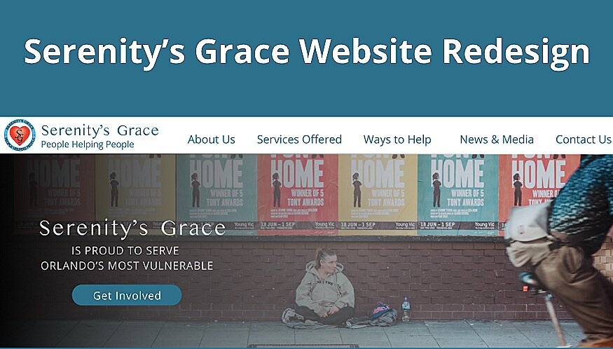
Overview: Redesign the website for a local nonprofit organization.
Problem Description: Serenity’s grace is a nonprofit trying to provide food and clothing for their Central Florida community. With outreach programs, food banks, and a budding thrift store, they are doing great work. However, volunteers have trouble finding out how they can help as the site has dead links and has not been updated in years. Most returning users use the Facebook page, and new users are only able to get involved through word of mouth.
My Role: UX/UI Research and Design, Interviewing, UX Writing, Wireframing, Brand Creation Prototyping, User Testing.
Collaborator: Deiondrick Roberts, Jordan Sewell
Time Frame: 3 Weeks
Serenity’s Grace is a nonprofit that became a real passion project after hearing what they do and their mission. Their site however was a constant pain point for them. It was an old design after their ori
Early on, it was determined the primary user of the website would be volunteers or those looking to donate to the organization. Upon interviewing the stakeholder, they indicated that while they did accept monetary donations, they were more interested in donations of times or resources.
While the website was colorful, it was lacking in clear information such as their mission, volunteer opportunities, and current funding goals. The proposed design would address the navigational and clarity pain points.
Notable Quotes:
Stakeholder: “I’d like the website to provide more accurate information.”
User: I cannot tell what they do when I first get to the website.”
Key Research Takeaways:
Having no clear mission or purpose statement detracted from the trustworthiness of the website, causing high user drop-off.
The design and navigational issues caused confusion in the users and made the organization seem like they were only asking for money.
The chaotic design and poor organization made finding volunteer or donation opportunities difficult.
It was important to make sure the users who visited the Serenity’s Grace website felt as though the organization had transparency and service as its primary values. We wanted to make sure whoever came to the site they could find some way to support and aid the organization.
Navigation was the first issue to tackle. It was decided to make the primary navigation as simple as possible and rely on secondary page navigation so as not to overwhelm the user. Each primary category would have secondary tab navigation on the page to avoid dropdown reliance and to let the pages and information speak for themselves.
Additionally, the volunteer page would get a major reorganization to make monetary donations possible, but not primary to the volunteering and resource donation aspects. A calendar feature was added so users could plan their volunteer experiences in advance.
The brand of Serenity’s grace is one of humility and service. For that reason, the color palette was toned down to a simple two-tone design. The most color comes from the images and personalities of those who volunteer to emphasize the bright and caring nature of the organization.
In the final desktop iteration and prototype, each page was accompanied by a hero banner that either came from the organization or was representative of the values of the organization. Additionally, the homepage design was set to offer the mission first, then volunteer opportunities. A News & Press section was added so users could find what the organization had done previously.
In the future, a mobile design could be made to make volunteering easy and intuitive. Additionally, connecting the facebook calendar to the website would allow new and current users to stay up to date on all the events.


